Moscow Irish Week
Ads, Logos, Print, Websites
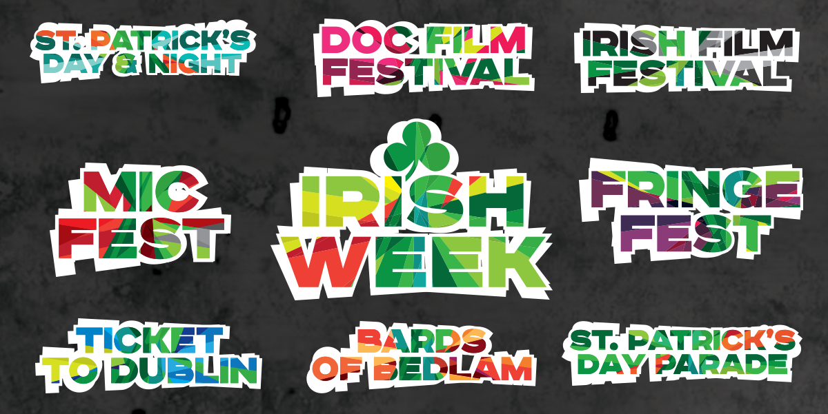
When we were asked to pitch for the Moscow Irish Week 2015 rebrand we just couldn’t turn it down. The event itself is the largest festival of Irish Culture in Russia so, with that size of an audience, it was a great opportunity to portray a dynamic and exciting vision of Ireland. Something the people of Russia might not have expected.
Project Details
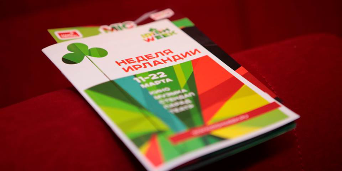
Moscow Irish Week was scaling up for its 2015 programme and needed a more professional look to show this. Workhouse were selected to deliver this new brand. The client was excited to portray a more modern vision of Ireland but felt it was important to keep the imagery recognisably Irish. They had some strong ideas of where they wanted to go and what they didn’t like which made the process more focussed.
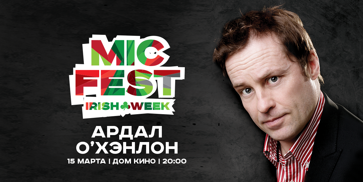
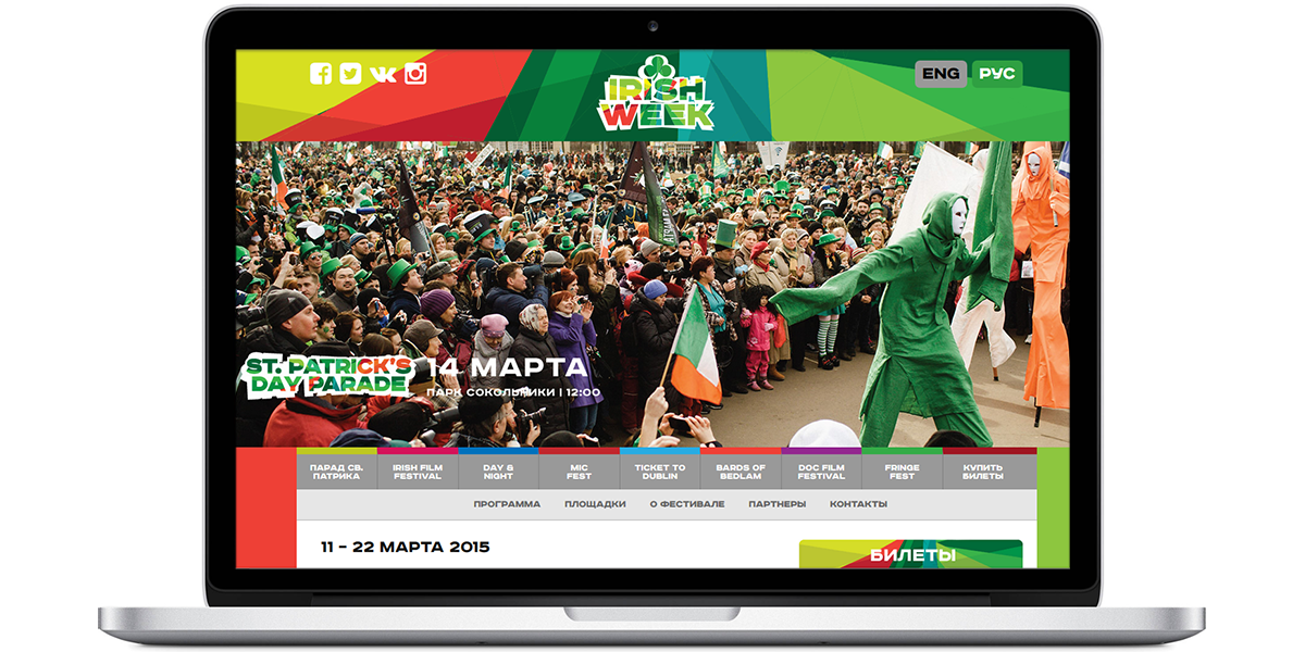
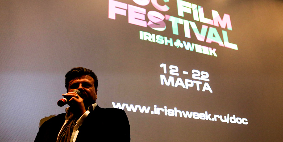
In addition to the new Moscow Irish Week brand we also created a bilingual box office website with the abilty to showcase and promote the huge range of events on offer. The programme includes the Irish Film and Documentary Festivals, The MIC Comedy Festival, a Fringe Fest and many others. Overall there are more than 120 events to choose from.
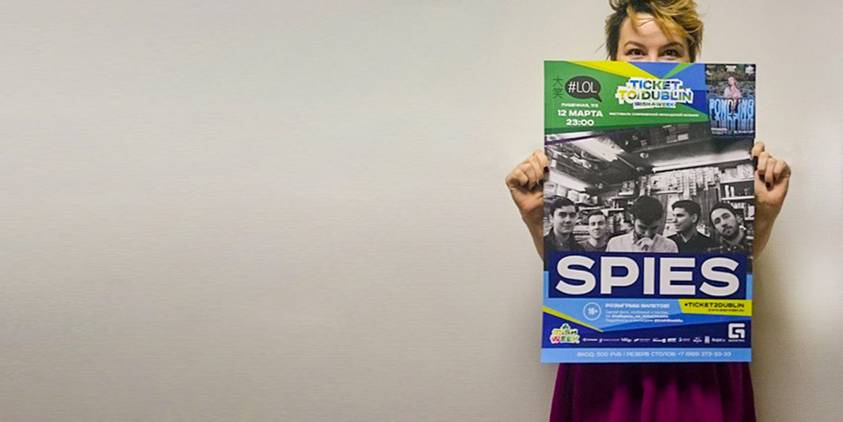
Once we had finished the branding and website we created templates for all the festival collateral so that the local designers could manage the substantial print and advertising requirements of this kind of event. One of the cool features of this project was that we got to work with excellent Russian designers who were delivering to our spec. It’s a tricky thing to do with the geographical and language differences but we were lucky to have such a great team at the other end.
Thanks Yulya, Margarita, Daria & Johnny 🙂

