Women in Property and Construction Ireland
Ads, Logos, Print, Websites
Women in Property and Construction Ireland is a business forum for women building a solid foundation in the construction industry.
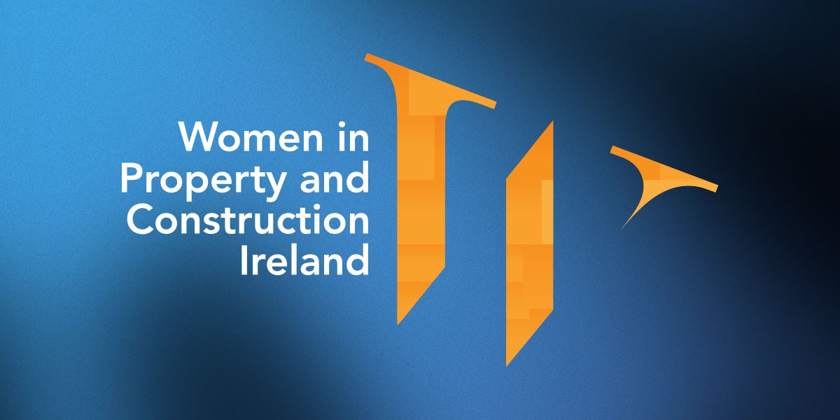
Workhouse were tasked to create a visual identity for the business forum Women in Property and Construction. They needed a logo that represented the group, something flexible, elegant, feminine, modern and something they could be proud of.
Project details
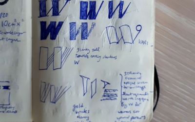
The angle combined with removing the ascenders is striking and allows the letter to create uprights, representig tall buildings and upwardly pointing arrows.
The pattern inside the letter are reminiscent of bricks to emphasise the property and construction elements, and adds extra visual interest without being distracting. The gradients give the logo a modern twist.
Avenir typeface is a no-nonsence type that is modern, friendly and easy to read. It calmly states who we are and lets the icon work. The type is right aligned to line up with and reinforce the vertical strokes.
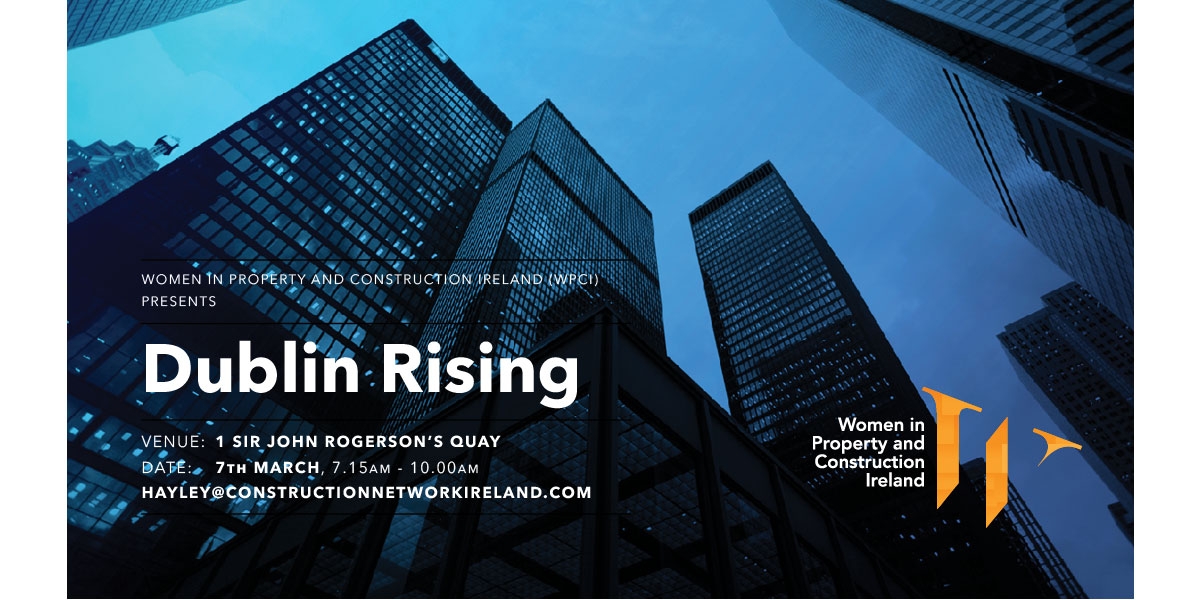
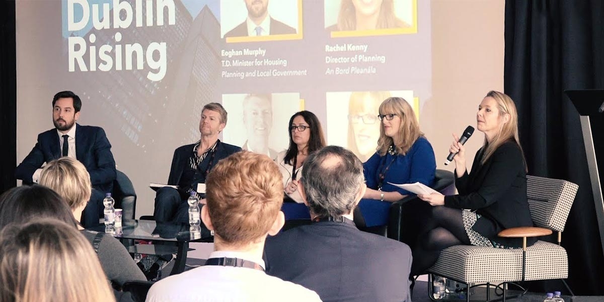
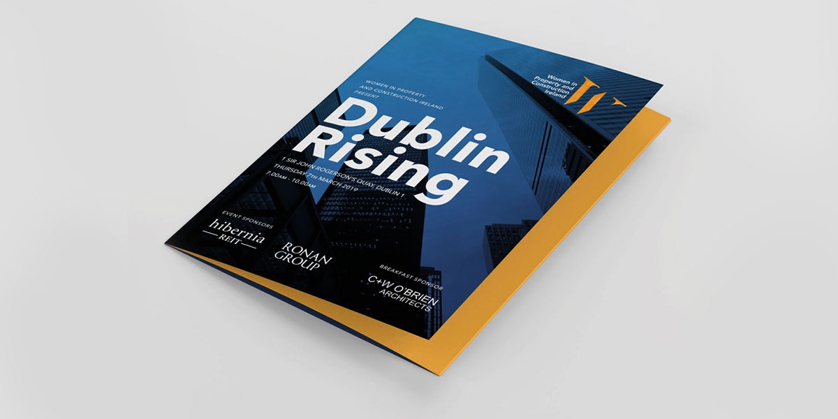
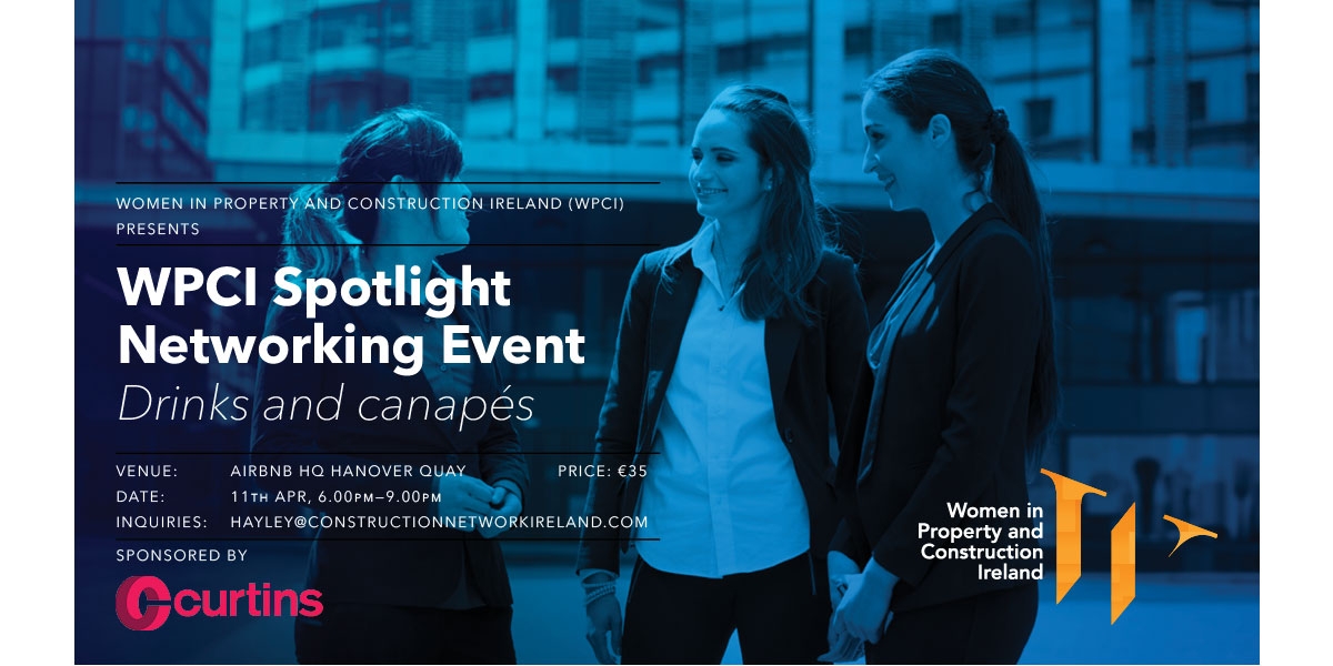
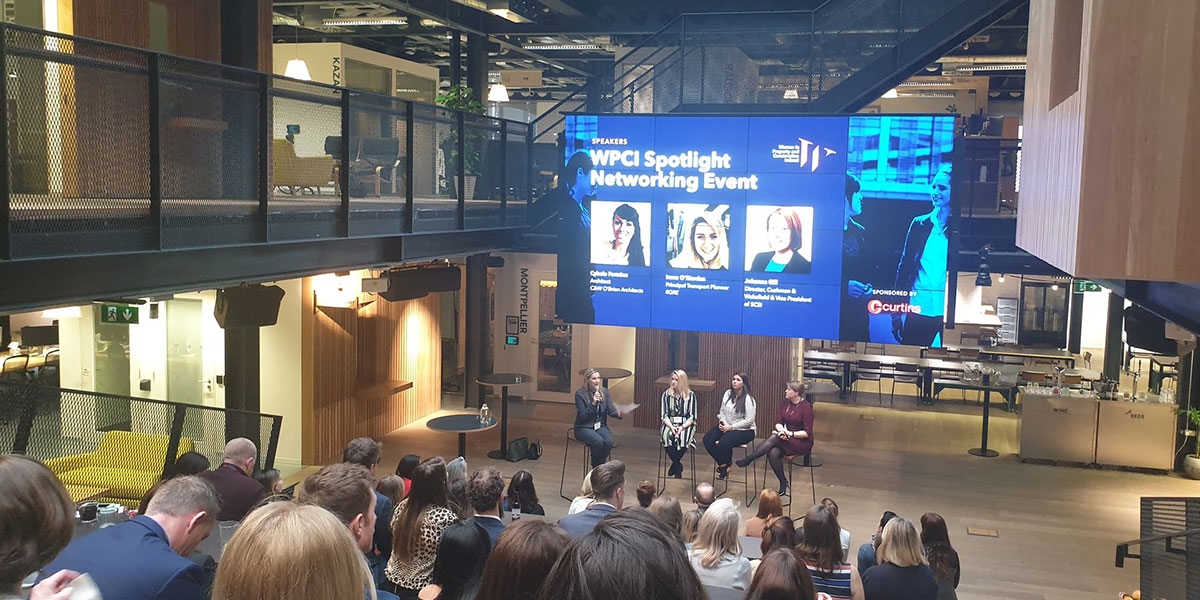
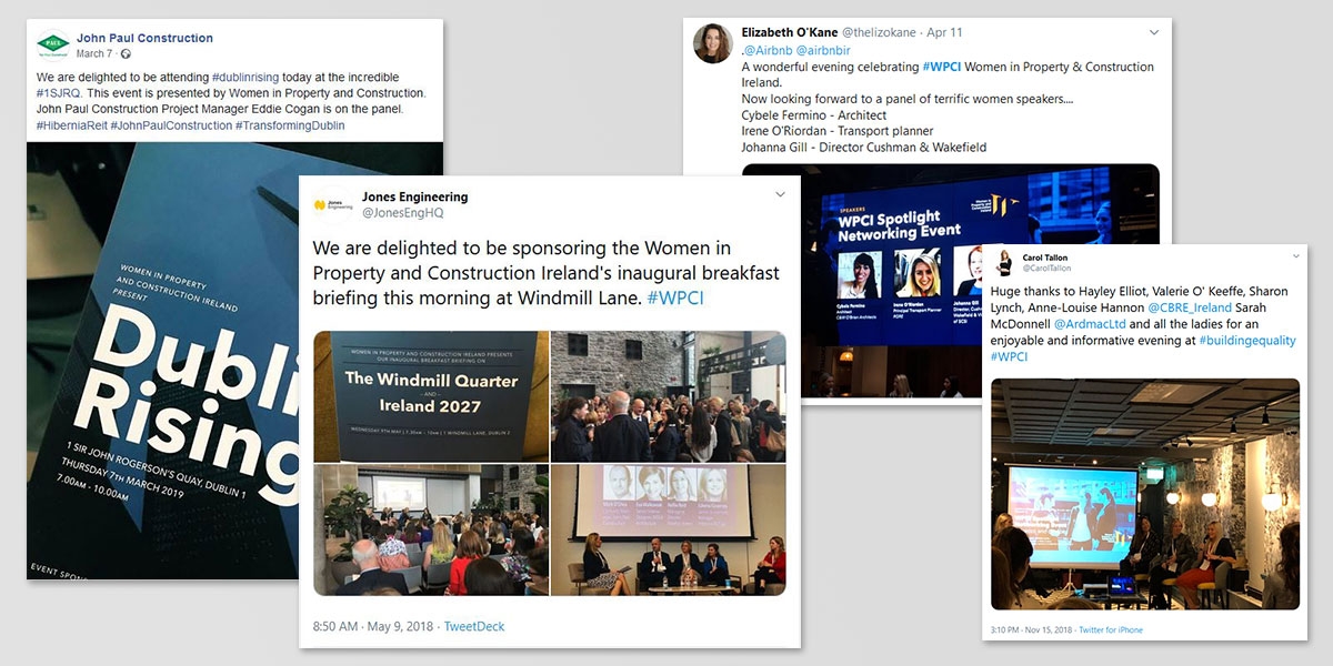
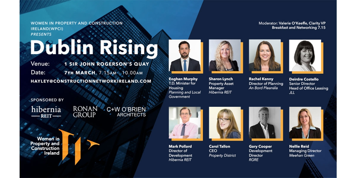
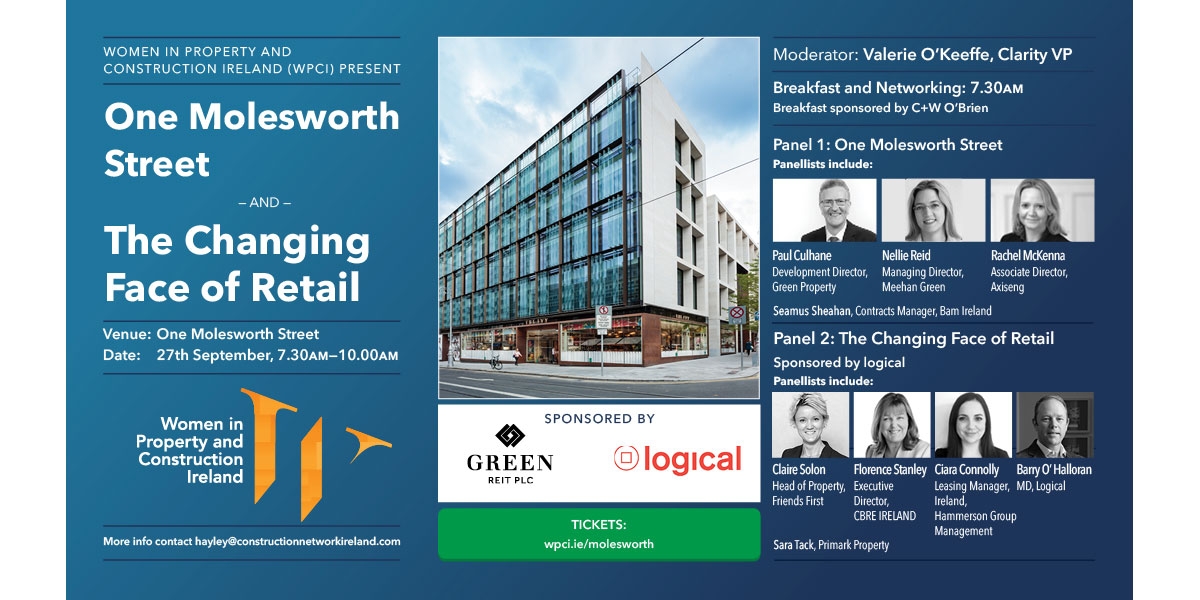
Furthermore, we created a suite of flyers, slide backgrounds, social media content, ads and handouts for each networking event.
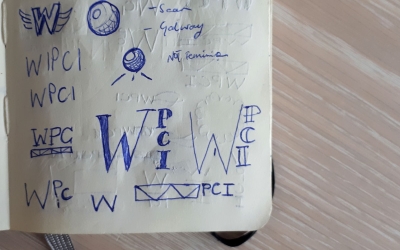
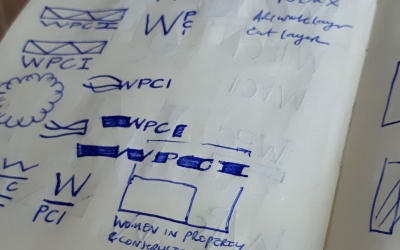
Behind the scenes

